Grace is mostly a Raymarine boat in terms of the key components responsible for navigation. The chart plotter, auto pilot, and helm instrument displays are all Raymarine, paired with sensors and devices providing data from many other vendors such as Maretron, Vesper, and B&G. Choosing Raymarine was deliberate back in 2015 when I bought Grace as I was looking for a very integrated suite of components that could automate the most frequent tasks on the boat while underway.
Updated articles on new Lighthouse software versions:
Lighthouse 3.1 and new autopilot integration features
Lighthouse 3.2 with Navionics and Fusion audio support
Lighthouse 3.3 – radar and AIS plus more
Lighthouse 3.4 – apps, bluetooth, find nearest, and more
Raymarine impressed me with the quality of hardware and software at the time, and the frequency they have come out with updates and enhancements to Lighthouse 2, their chart plotter operating system. They also had a great wheel-based autopilot that has been very reliable while underway. Recently, they announced Lighthouse 3 and the Axiom family of chart plotters. I have had the 9″ version of the Axiom for a few days, and these are my first impressions.
Axiom Hardware
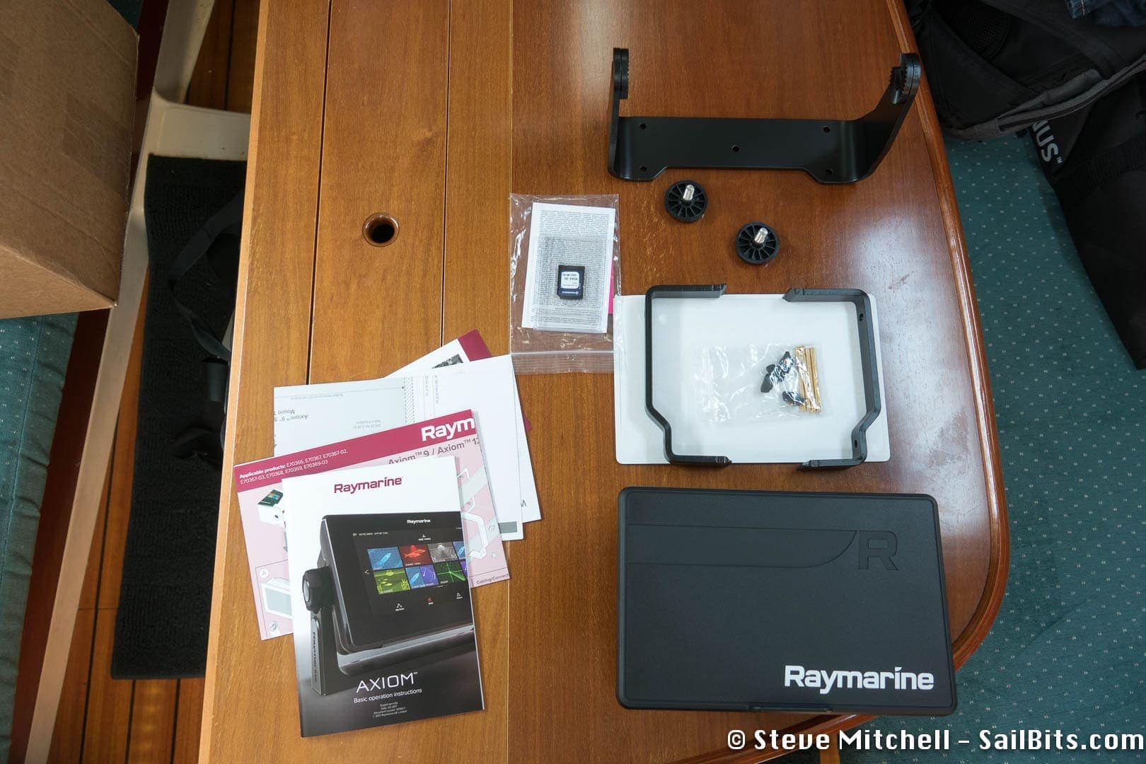
Raymarine Axiom 9 box contents
I ordered the Axiom 9″ version with Navionics charting included. I felt this to be a great size increase over my 7″ es75, which was quite small for charts at the helm. In the box you get the chart plotter with cover, manuals and literature, mounting options, and for my model, the Navionics SD card.
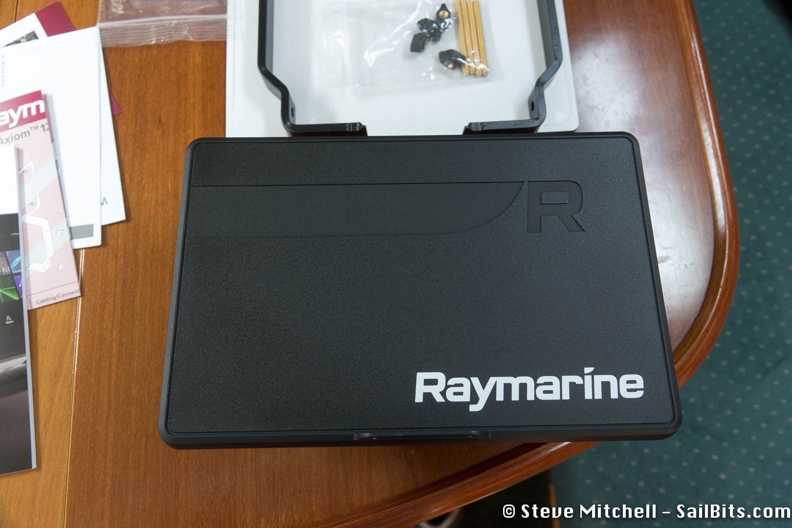
New Raymarine logo on cover
This is the first Raymarine product I’ve seen with their new branding – front and center on the sun cover.
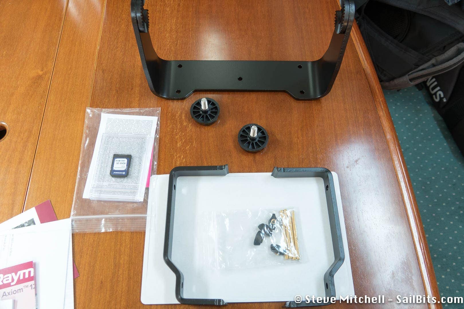
Mounting brackets and options
There are the usual trunnion mount and flush mount kits. The flush mount option is a bit different than what I have seen before – the two brackets in the bottom of the picture above sit on the back of the unit inside the hole you cut, allowing for a screw-less install.
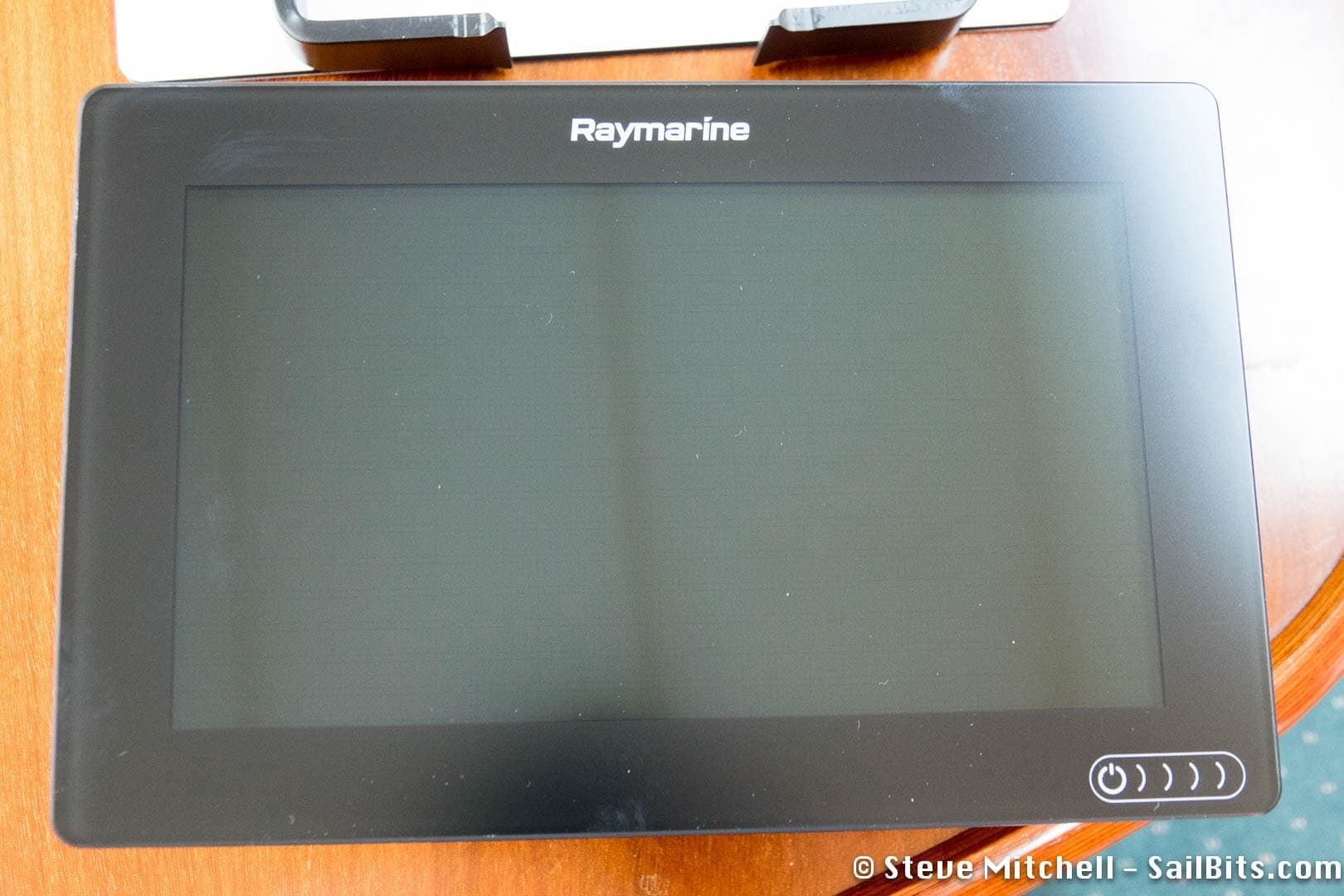
Front of Axiom 9″ unit
The front of the unit is one big piece of glass, with a power button in the bottom right of the screen.
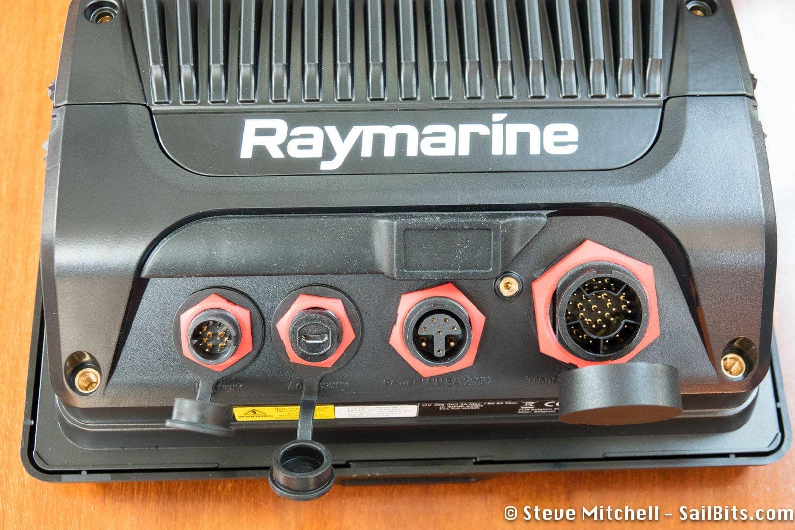
Back of unit with ports
On the back of the unit, from left to right, are ports for the RayNet network, USB accessory for RCR-SDUSB card reader, power/network, drain wire screw hole, and 25-pin transducer port.
Above the ports is the SD card cover and slot (the black rubber rectangle). I’m worried about accessibility – I plan on mounting this in a NavPod which will require that I open it up to get to the card when needing to update Navionics, and for downloading screen shots and the like. In addition, there is only one SD slot, compared to two in my es75, which is also disappointing – I use both Navionics and Lighthouse charts on separate cards.
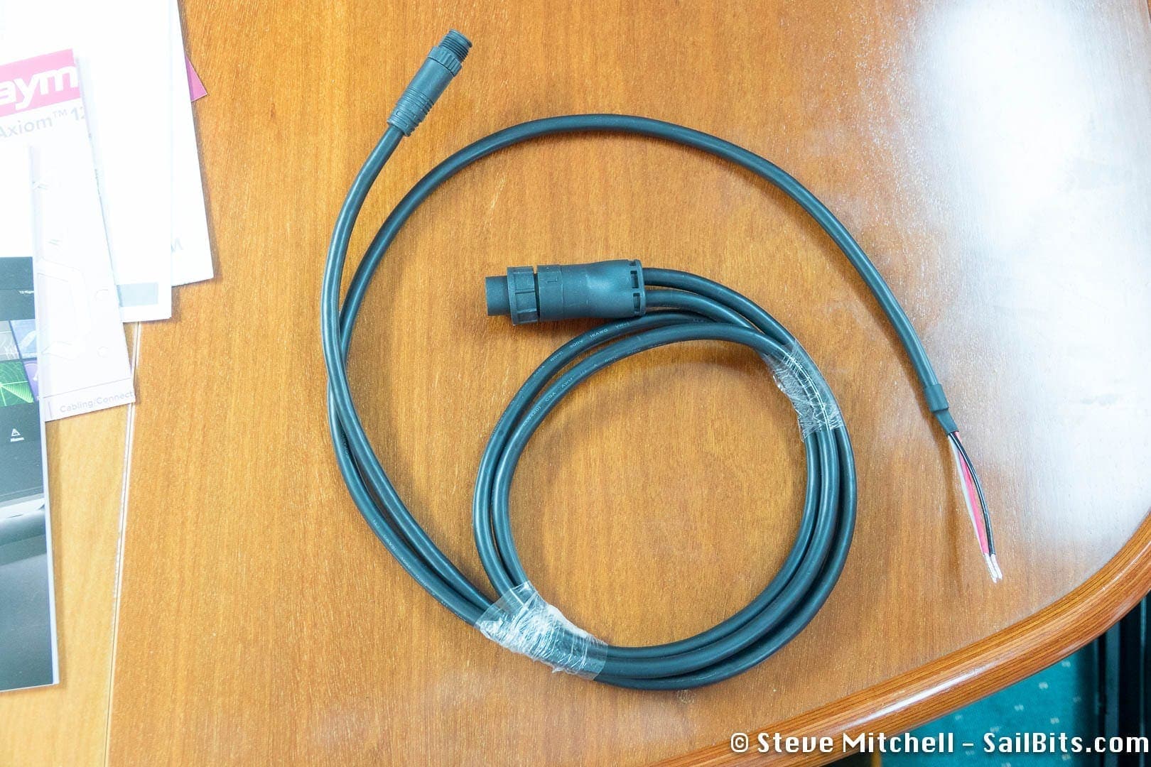
Power and network cable
The power and network are combined into one cable, included with the unit. There are three wires in the power cable – one positive, one negative, and one drain wire. According to the installation instructions, the grey drain wire needs to be sent to a ground on your boat, and then a separate wire back to the drain wire screw on the back of the unit. This is the first time I’ve ever seen a unit requiring a separate ground like this, but it looks like it could be part of a new specification.
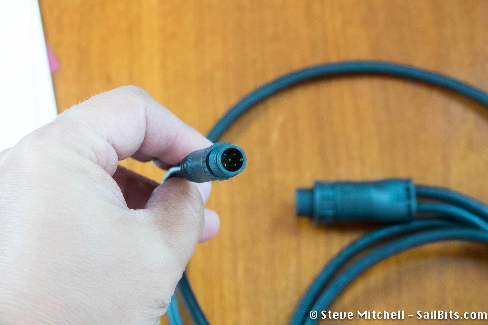
NMEA 2000 network port
The surprising thing about the cable is that there is no SeaTalk connector – standard NMEA 2000. Given how much Raymarine focuses on SeaTalk for all of their other products, and that has to be a revenue source for them, it is a surprise to see a standard NMEA 2000 network connection on this cable, but I’m not complaining.
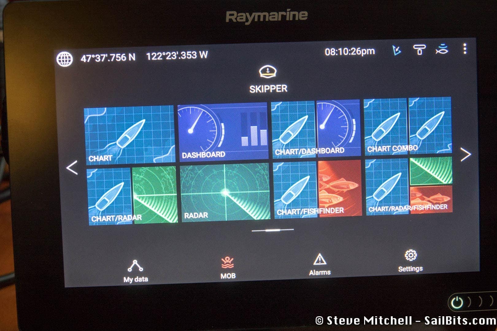
Axiom 9 screen
The quality of the screen is better than my es75 and B&G Vulcan. Clearer picture, easier to see from more angles. That’s one thing that has always frustrated me with B&G – with polarized sunglasses on it has only a narrow field of view. Not so with the Raymarine. This unit has 800 x 480 resolution and 1200 nits of brightness.
Several other vendors have higher resolution panels in products of similar sizes, but I would take a brighter screen, viewable at more angles, and with a much more accurate touch screen over a bit more resolution. While I am looking at charts constantly on this thing, I do most of my planning elsewhere where I would want higher resolution.
The power button is a bit strange – you swipe across it to the right turn the unit on and off, and to pop up a quick menu while the system is running. I’m not sure if this choice was so there aren’t accidental button pushes and to not have a mechanical button for water ingress. Reminds me a bit of unlocking an iPhone.
Overall the hardware is well made, solid chunky build with quite a bit of weight to it. It appears to be the high quality I’m used to seeing from Raymarine.
Lighthouse 3 Software
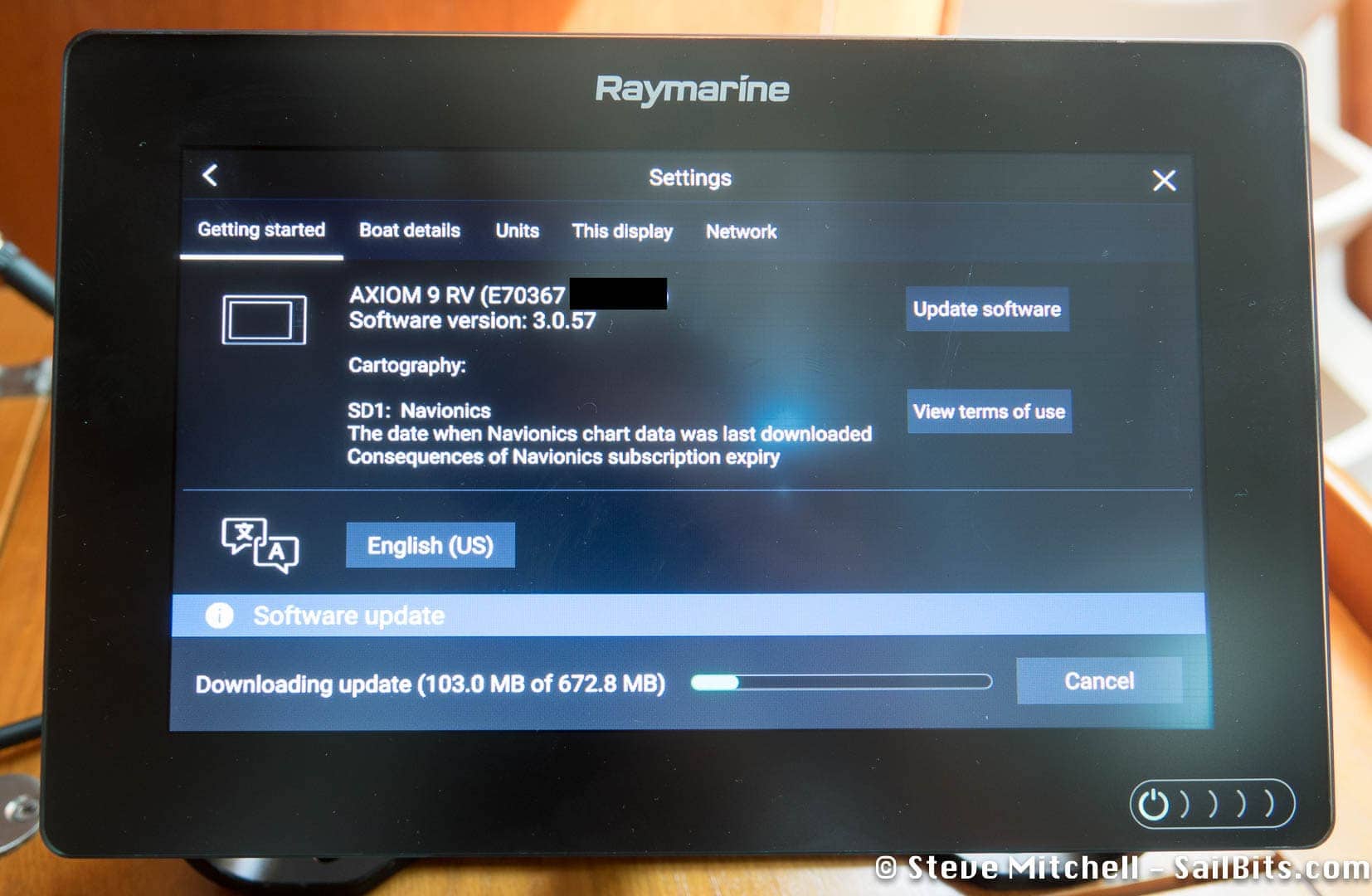
Lighthouse 3 software update
On first boot, I immediately went in and connected to WiFi to check for a software update. I was offered an upgrade of about 673MB which took a few minutes to download and install. The unit came with v3.0.57 and I upgraded to v3.0.66 (as of June 9th, 2017).
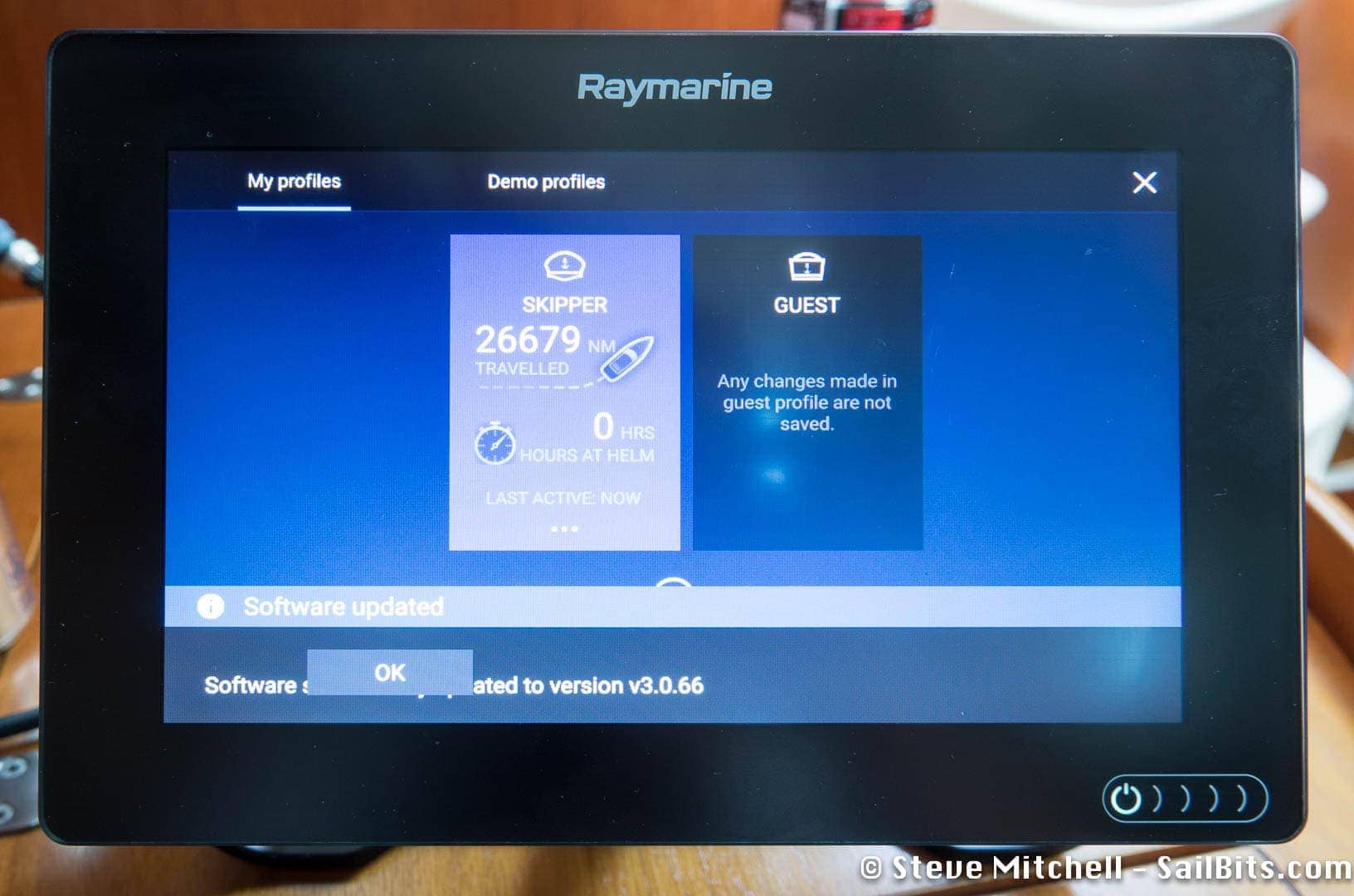
Upgrade weirdness – note the OK box that is across the text. I could not click OK…
After the upgrade I couldn’t click OK to confirm it was updated – I had to reboot twice to get out of the screen weirdness. That’s one thing that I saw in several other places – this is definitely a new product with new software that is … not quite finished.
Fast!
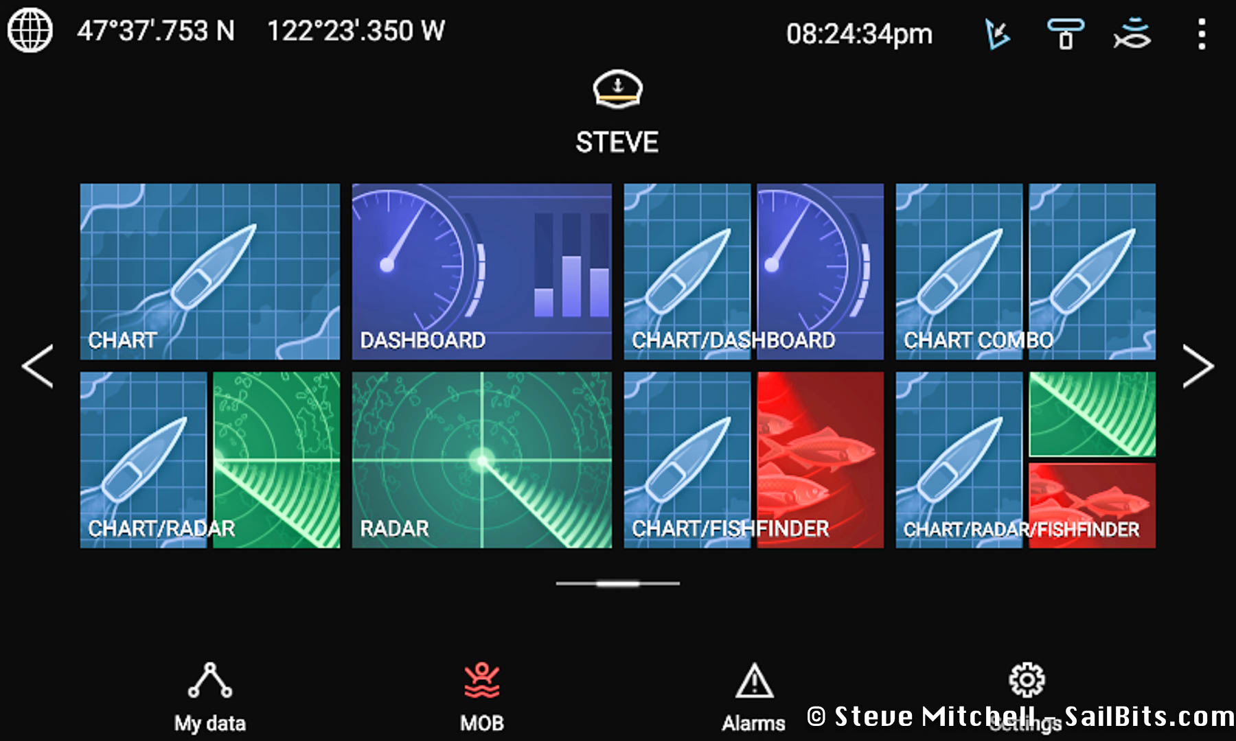
Main startup screen
This thing is fast! They mention it having a “quad core processor” in the marketing videos, and it definitely does not disappoint. It boots very fast, and has little animations every time you touch one of the main screen icons to launch something. Everything is smooth and quick, no stuttering, and it just feels more modern and up-to-date than most chart plotters as a result of the speed.
The touch screen is also extremely accurate compared to my es-series, and other chart plotters. It is close to iPad accuracy, which is saying a lot, and makes for very quick and easy use.
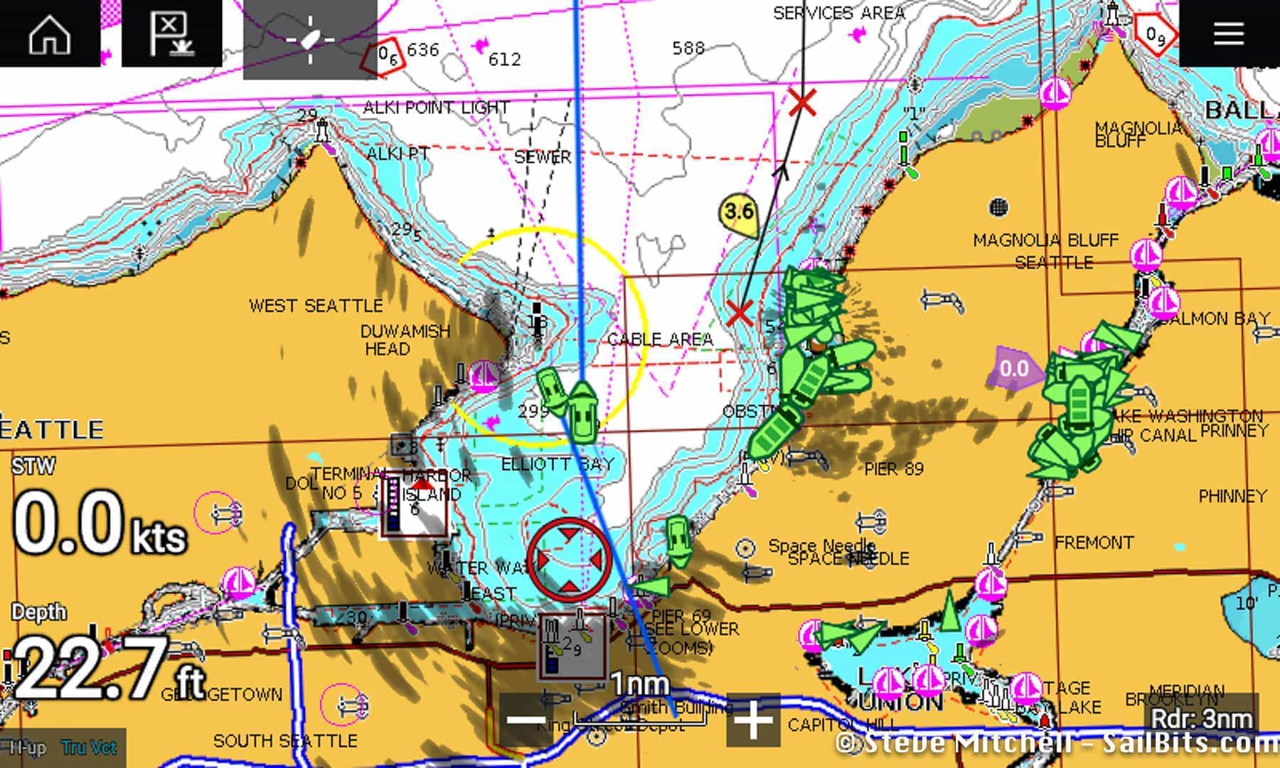
Chart screens render quickly and clearly
Things everywhere are faster, but nowhere did I notice it more than in the charts. Zooming and panning around in Navionics charts is as fast as on a PC using Coastal Explorer – that is a first for me in using chart plotters. My es75 will routinely stutter when moving around in the charts, or simply take a long time to redraw everything. I have yet to get the Axiom to stutter or slow down appreciably.
Usability
The other major area of improvement is usability, and you see this everywhere throughout Lighthouse 3. This is what excites me the most about LH3 and the Axiom platform – instead of locking you into specific areas to lay out data, or in one set of settings to use, Raymarine have really thought outside the box and made things more easy for the end user to interact with and customize.
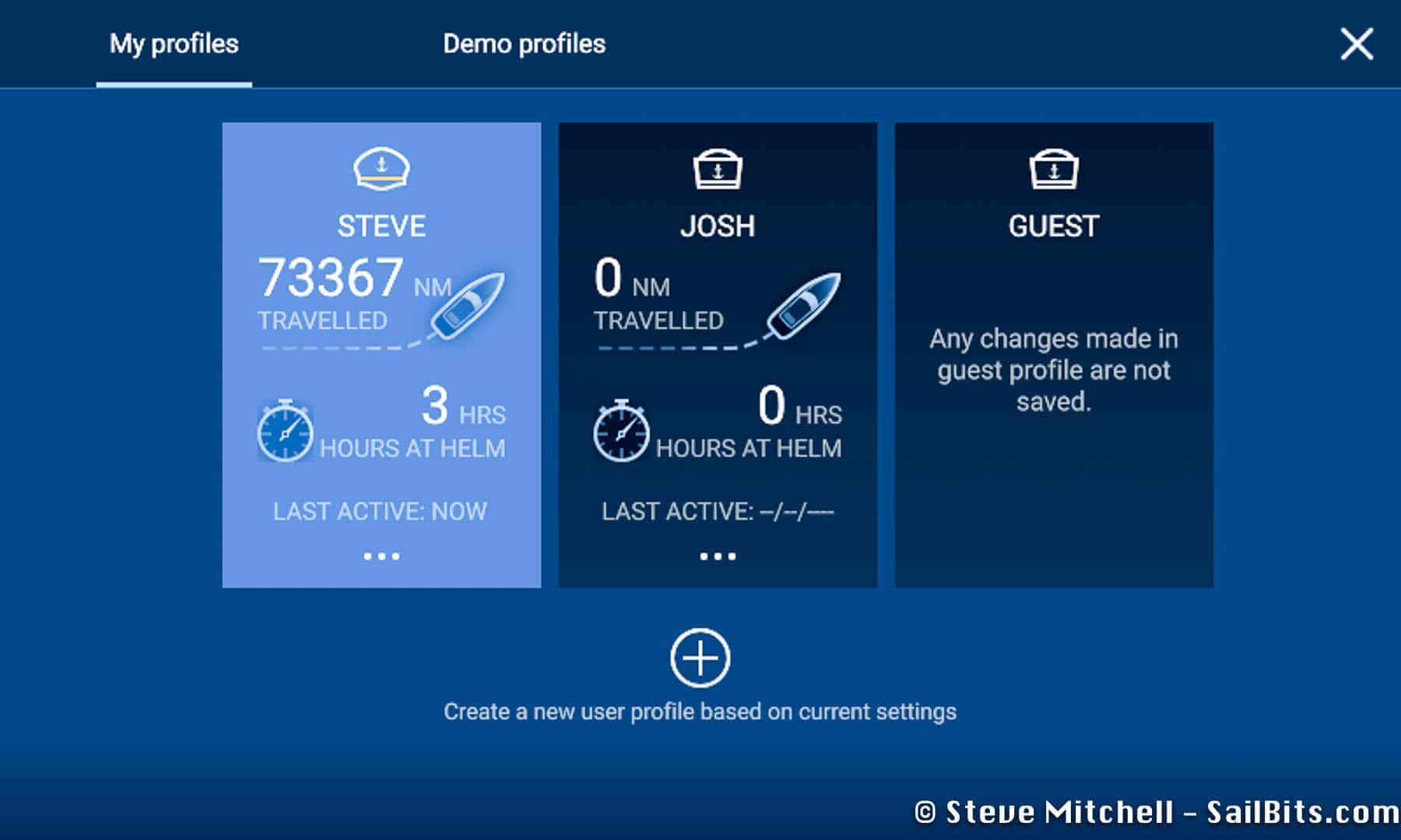
My profiles
A great example is profiles – the ability to setup preferences based on individual users. Useful to adjust things just the way you’d like, and let the next one at the helm setup their own preferences. It also appears to track the amount of time you have been at the helm.
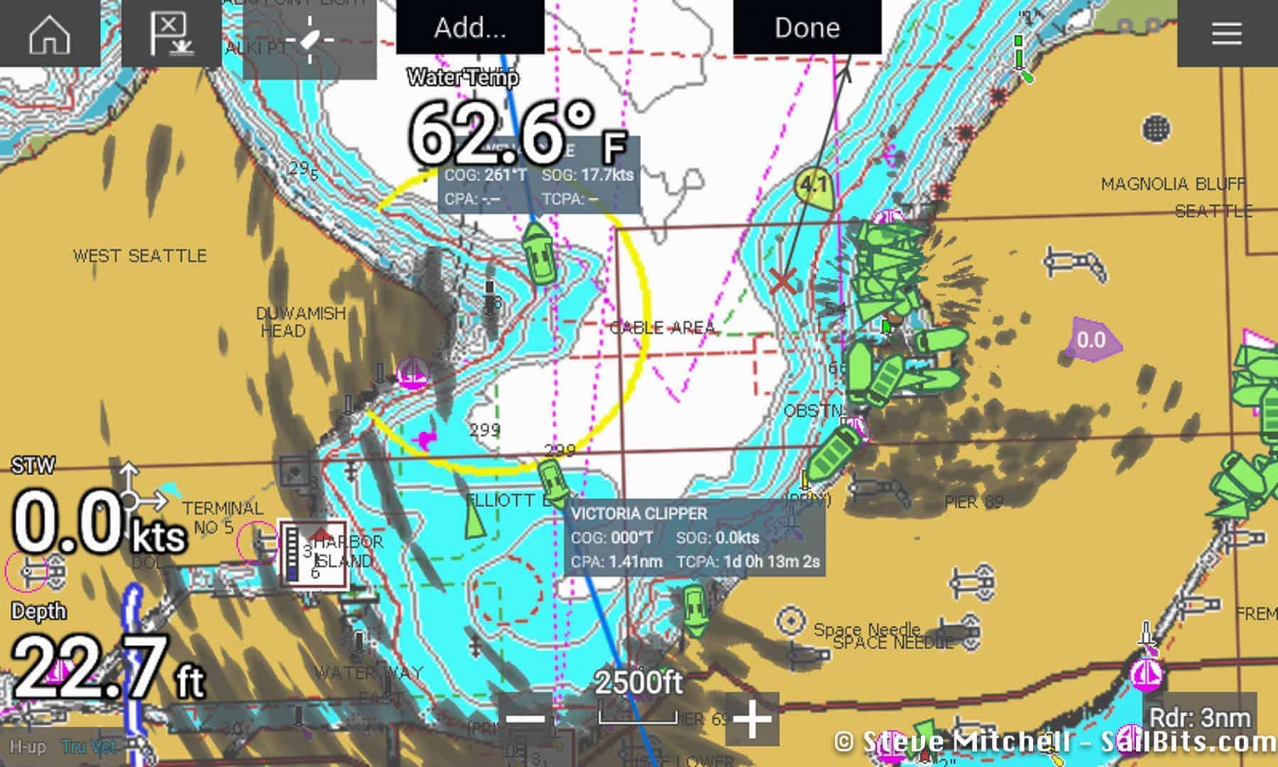
Data overlays
The other one I love is the ability to overlay data on the canvas – charts, radar, etc. Above I’ve added the sea temperature near the top of the screen. Hard to catch in screen shots, but you can resize, move them around, delete, and do all sorts of other things to them. Gone are “data bars” and other things that take up precious chart screen space all the time, or don’t allow you to move them to where you want them. I think this is my second favorite item in LH3.
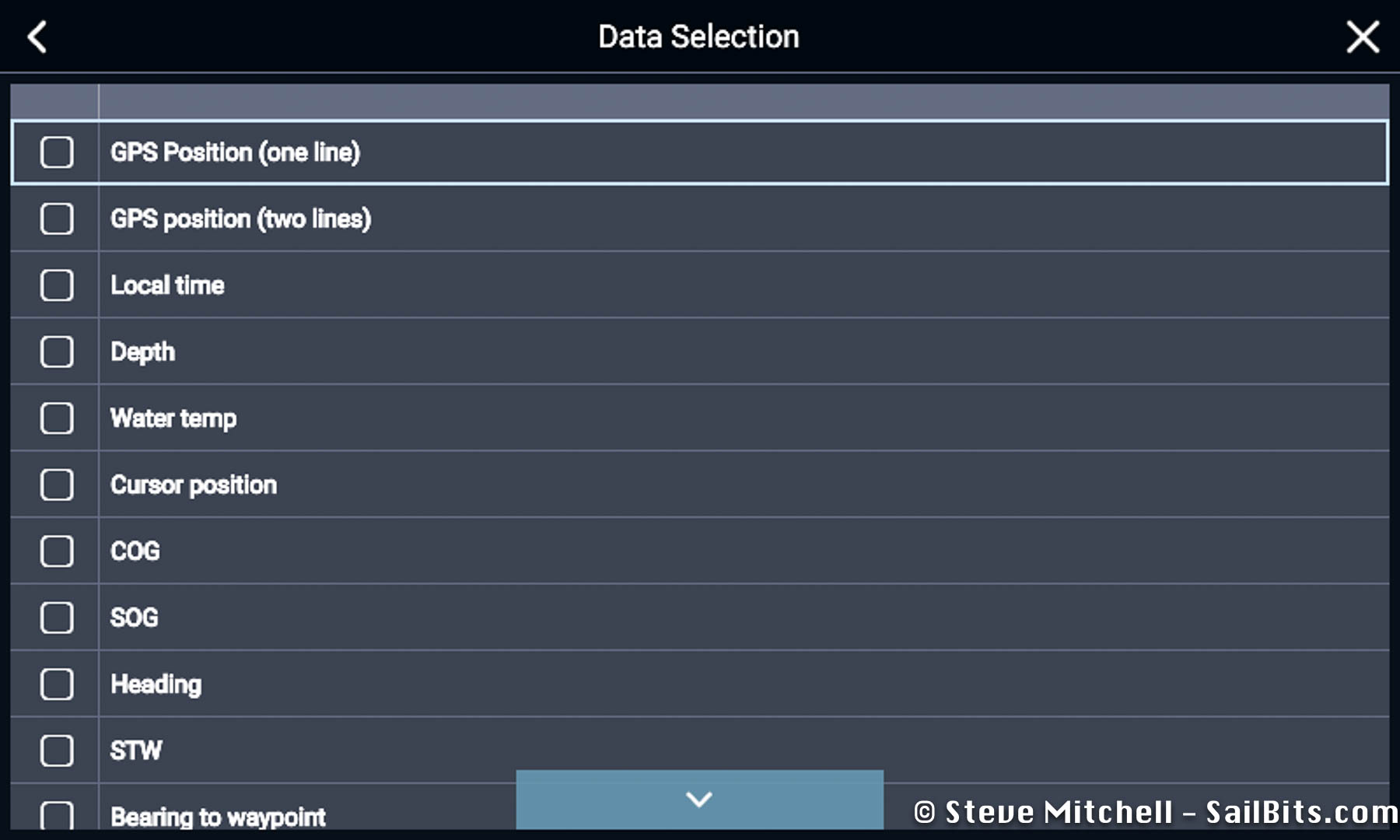
Data overlay selection
There’s a bunch of different data bits to choose from, but there are still some missing items compared to LH2 data boxes such as battery amps and the like. Hopefully these will be added back in future software releases.
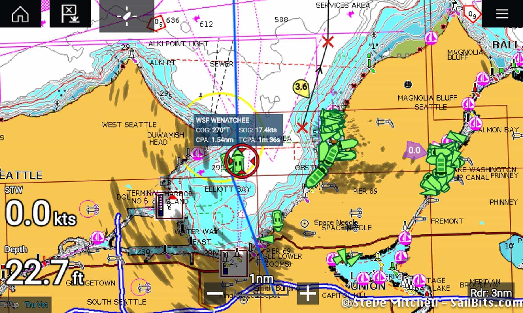
Quick actions
The other big change usability-wise, and my #1 favorite item in LH3, is the quick actions that have been placed on the various canvases. On charts, there’s a button on the top next to the man overboard button to center the map on your ship, something I have done on my es75 hundreds of times, and it takes two or three clicks/touches – on the Axiom it is one touch.
In the bottom right corner, you can adjust the radar scan range with one touch, again, something that took multiple actions before. Great ways to help me do things faster and easier!
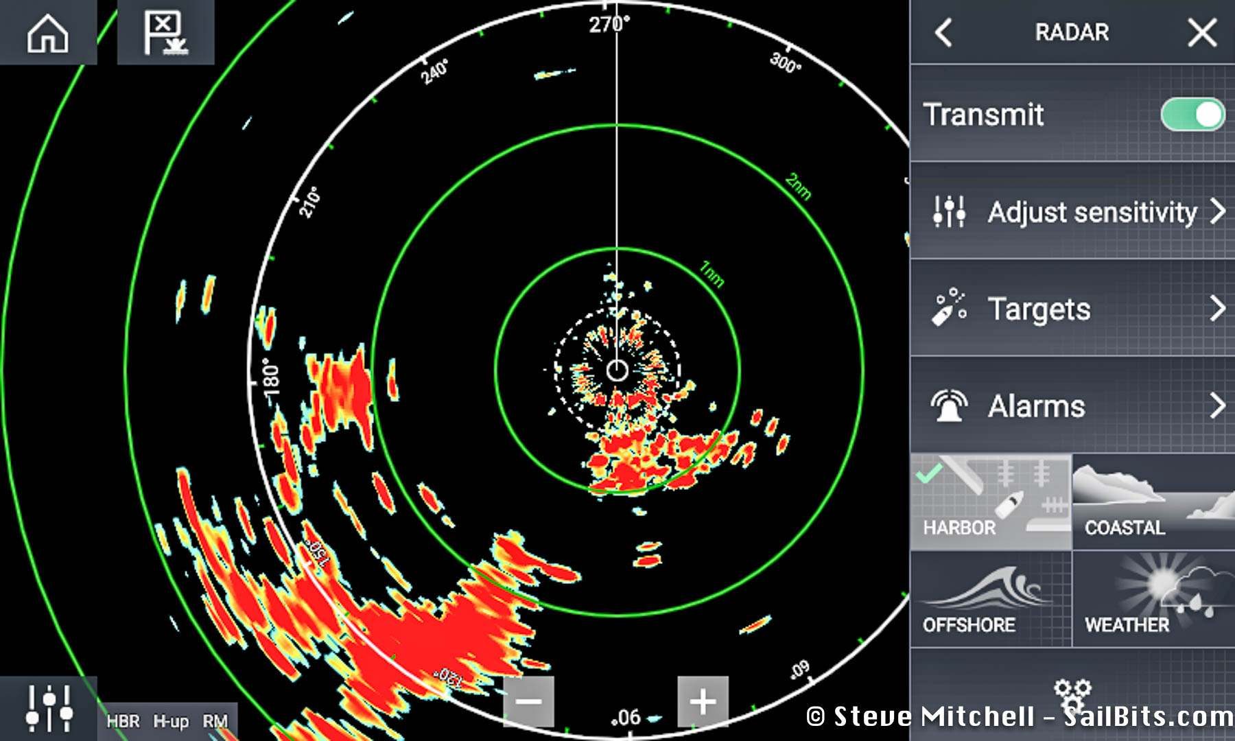
Quick mode selection in radar
There are new, clearer icons to choose modes for the radar as well – another example of usability being carefully thought through in LH3.
Throughout Lighthouse 3 there are many little items that they have done to help with usability, speed to use the system, and general refinements. It feels like a modern operating system instead of something several generations behind.
Below I have some basic observations about major sections and screen shots from each.
Settings
Here are a few updates / changes in Settings:
- Clearer icons and navigation
- User profiles & pre-built profiles
- Boat type icons
- Fancier display of satellites
Charts
Here are some of the things I noticed in Charts:
- Faster than anything else out there
- New AIS icons that are easier to understand
- Data overlays are an awesome way to add custom data on your chart
- Quick access to “find my boat” and radar range save clicks/time
- Popup data boxes and tracking improved
- Lots more options in settings for chart options -> advanced
- Targets has a lot more data & some new options
- Route planning has more options – fixed SOG to see estimated times
Radar
Here are some changes and updates in Radar:
- Quicker access to change radar settings
- Lots more settings for Quantum radar – color palette, IR level, etc.
- Timed transmit – was that always there?
Note: my Quantum WiFi radar has been completely unreliable since the upgrade to 3.x and the Axiom MFD. Subscribe to my forum post to get updates.
Dashboards
Here are some changes and updates in Dashboards:
- Much more modern / easier to look at screens
- More dense screens with more spots for data
- Rolling road much nicer to look at
- Smoother gauges and updates
Other
I did not test fish finder settings or screens as I don’t have one.
Audio didn’t work for me with my Fusion radio, and I don’t have any cameras.
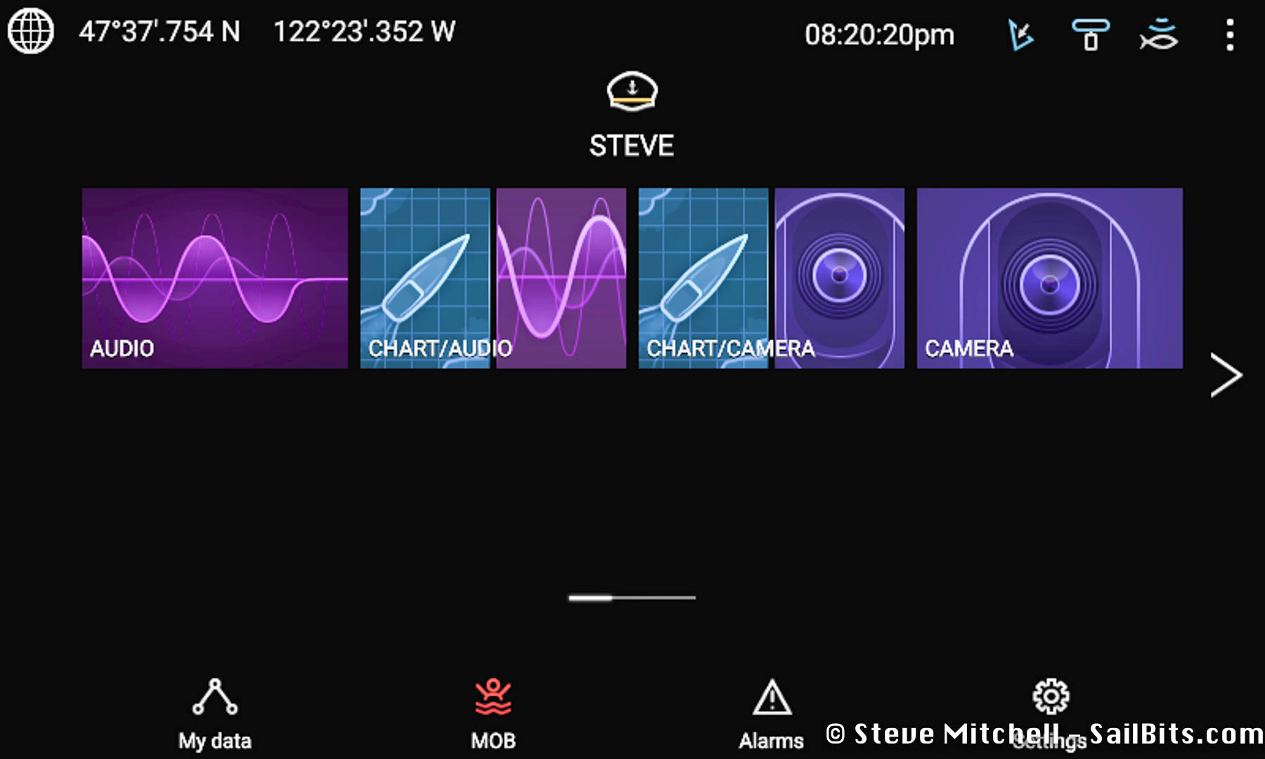
Audio and camera
What’s Missing?
Auto pilot
There’s no control of my Raymarine EV1 auto pilot, no pop-ups, nothing. This is expected according to Raymarine, but it does limit the ability to use the whole system for navigation.
This has been released as part of Lighthouse 3.1 – read about the details in Lighthouse 3.1 – autopilot goodness.
Navionics auto-routing
Raymarine has also made it known that this feature is not yet in LH3, but I thought I’d call it out as it is a very popular one. I use it constantly to quickly build out a route when I am out on the water and need to change something. I hope to see it very soon.
This has been released as part of Lighthouse 3.2 – read about it in Lighthouse 3.2 – Navionics auto-routing and Fusion support.
Audio
According to various posts online, Fusion marine stereos using NMEA 2000 should work with the Axiom, but in my testing it does not. As of 5/16/2017 on the Raymarine Forums here, it has been stated that Lighthouse 3 does not support Fusion at this time, and it looks like this has been prioritized lower than other things.
This has been released as part of Lighthouse 3.2 – read about it in Lighthouse 3.2 – Navionics auto-routing and Fusion support.
Conclusions
I am going to be using the Axiom as my primary chart plotter even with the missing features and stability challenges. The usability improvements in Lighthouse 3 along with the larger screen make it far more useful with those issues, and I want to see the other new features and functionality that I hope will be coming. I’ll provide an update on any new features as soon as I get them!
Pros
- Bigger screen / touch accuracy
- Fast
- Usability
- Quick settings
- Data overlays
- Improvements in dashboard data / density
- More settings for radar

