I have discussed my weather dashboard before in Real-time weather from the boat, but I have always wanted more visibility into other areas. I have a couple of new dashboards for engine performance and the electrical system which are detailed below.
Earlier this week, I participated in a webinar hosted by Influx and co-chaired by Teppo Kurki from Signal K and showed off some of my new dashboards. The webinar was recorded and is available here online.
We cover the basics of why this solution is important, talk about how to set it up and how Teppo created it, and field almost 30 minutes of really cool questions at the end. I highly recommend watching it if you are interested at all in these dashboards.

You can also find the presentation here if you want to look through what we covered.
Software Setup
All of the data for these dashboards is stored in InfluxDB and gets there via Signal K using a plugin. You can see more details in the presentation above, or my original post on how I set this up.
It is relatively easy to setup Signal K and the plugin to store the data. If you have a computer with a NMEA 2000 interface, or if you have a gateway that sends out data on the local network like a NEMO, Yacht Devices, etc. you should setup Signal K and start saving the data very easily.
InfluxDB is a time series database and it is very efficient.

I have 7 months of data in my database, which appears to be taking just slightly over 9GB. I have quite a lot of systems on my NMEA 2000 network, plus data coming in from my Victron power system, and a few other sources. The size of the database will be based on how much data you’re logging and from where.
What do you store it on?
I use an Intel NUC i3 at least 1 or 2 generations old from the current shipping systems. It has 4GB of RAM and a 100GB SSD.
You can use a Raspberry Pi to run all of this just fine, but I prefer a slightly larger platform for two reasons. First, I like being able to look back at trends from months ago, and doing that on a Raspberry Pi can take quite a bit of time. Second, and more importantly, I want my data stored on a more reliable source than the SD cards used in Raspberry Pi’s. An SSD is far more reliable.
I also like NUCs because you can run them directly off of DC power. You can read more of why I like NUCs in general here.
Usage
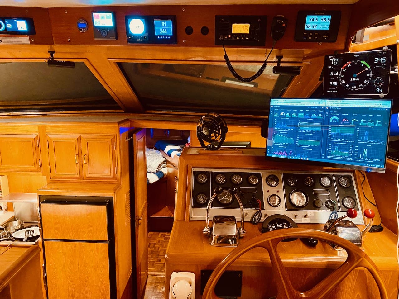
I have the weather and electrical dashboards up while I am at anchor almost all the time. They usually appear on the 22″ touch screen monitor in the salon, but I also Miracast them to a TV sometimes so I can have a bigger canvas, or have them displayed on a USB-C remote monitor up on the flybridge.
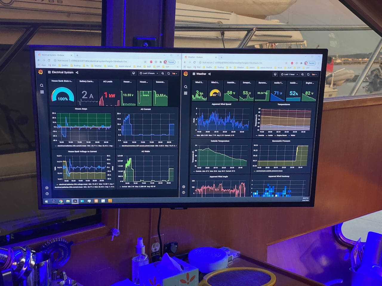
Since they are generated by the NUC running Linux that is up in the Internet Alcove, I can open up the dashboard from wherever I want. Sometimes I use my phone or iPad, other times they are on display in the salon, and even more times I use them remotely via my VPN to check on things when I am not around.
Weather
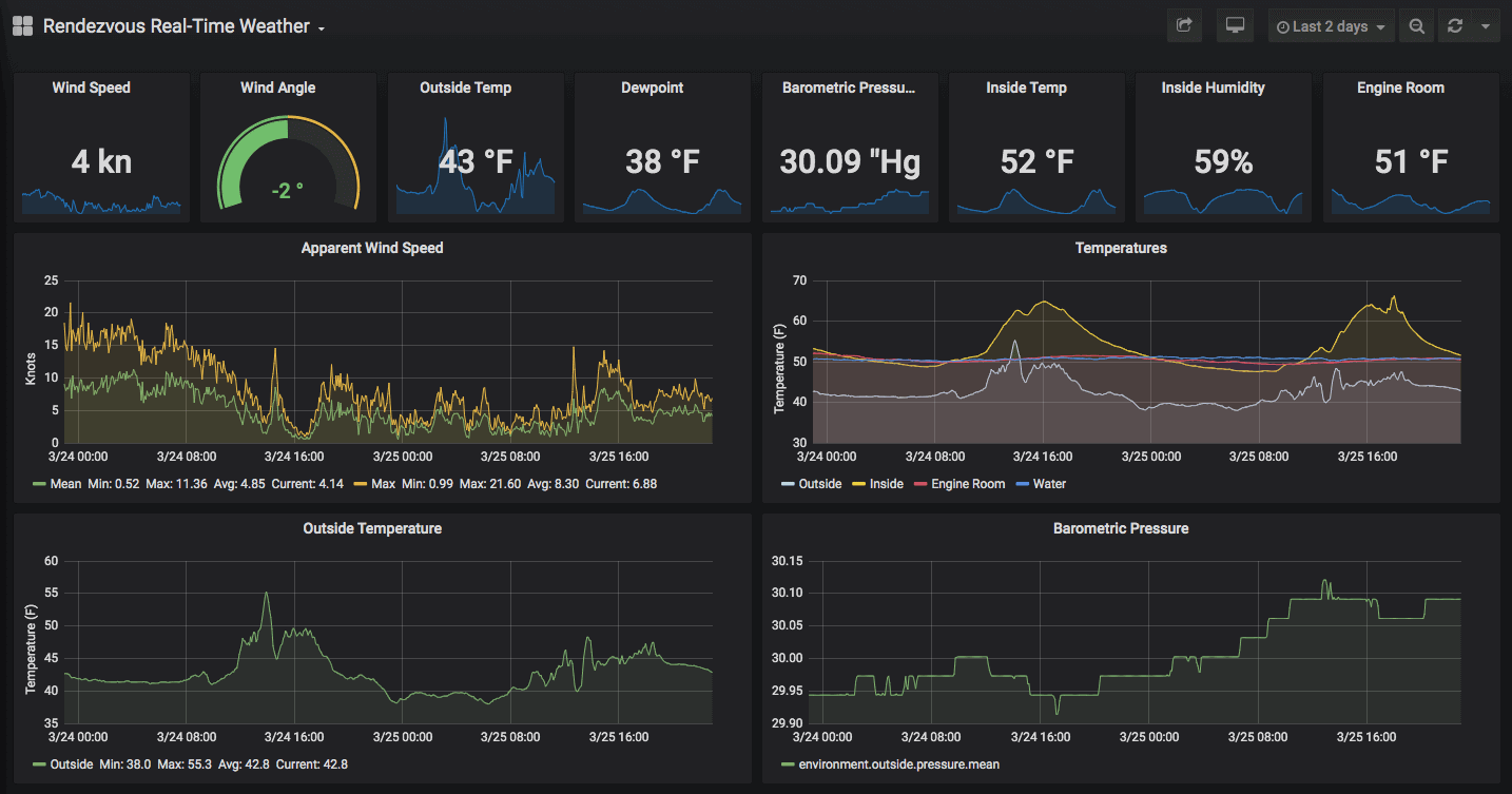
The weather dashboard was the original one that inspired this, and I’ve updated it with a few new pieces.
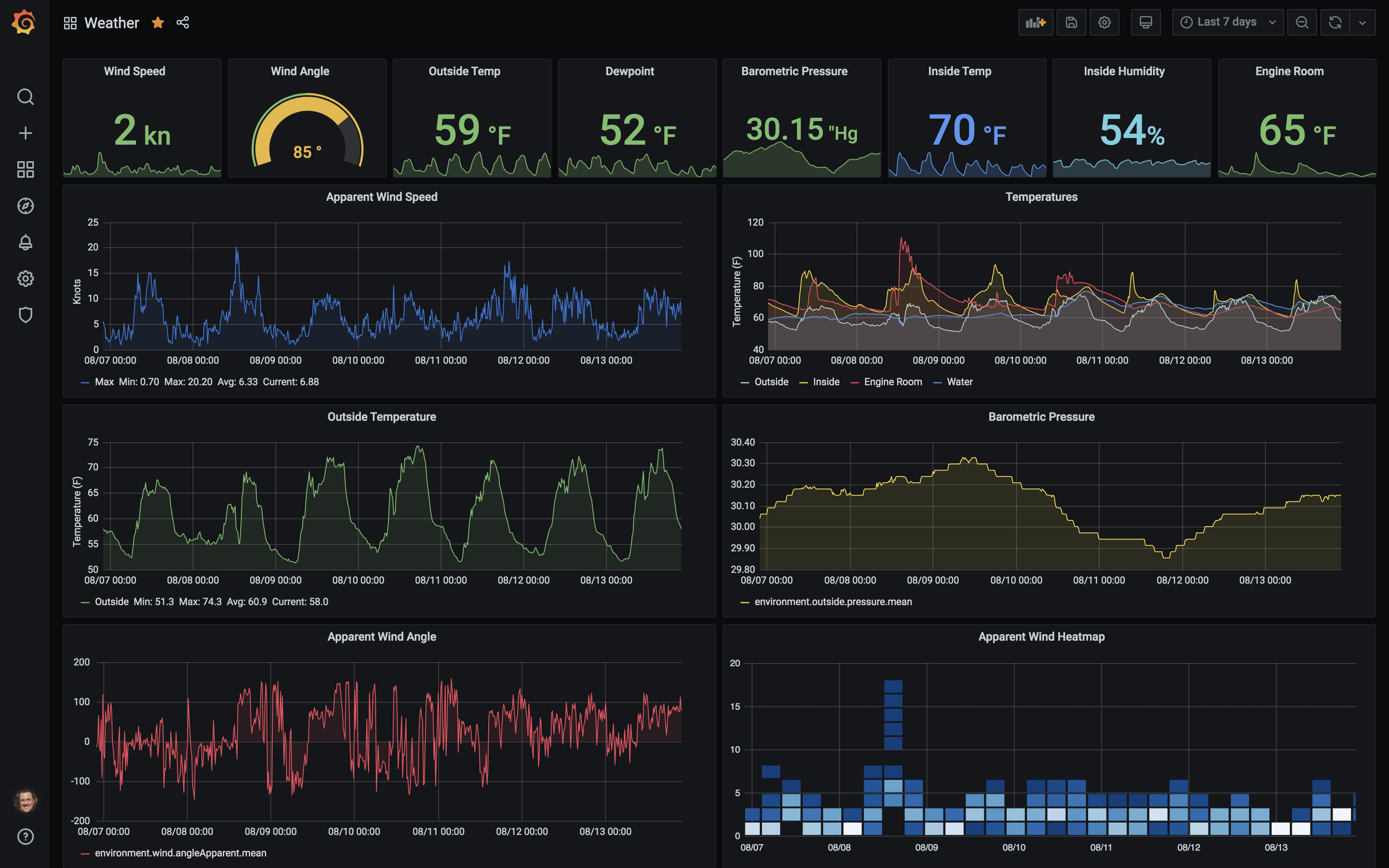
I’ve refined a couple of the graphs to provide more accurate data. In addition, I changed the little square stats at the top to use colors depending on the values and thresholds. For instance, I have the inside temperature change to red if it is above 80 and yellow if it is below 50.
I use this dashboard while at anchor so the little stat boxes as a way to see the current conditions very quickly. I use the lower graphs to look back at the wind the last few hours, or to look up a storm or something weeks later.
Engine Performance
This data has been logged for months, but I didn’t have the chance to figure out proper conversions until recently. A lot of the data that is sent across to Influx from Signal K is in various different formats, and needs a little discovery to figure out.
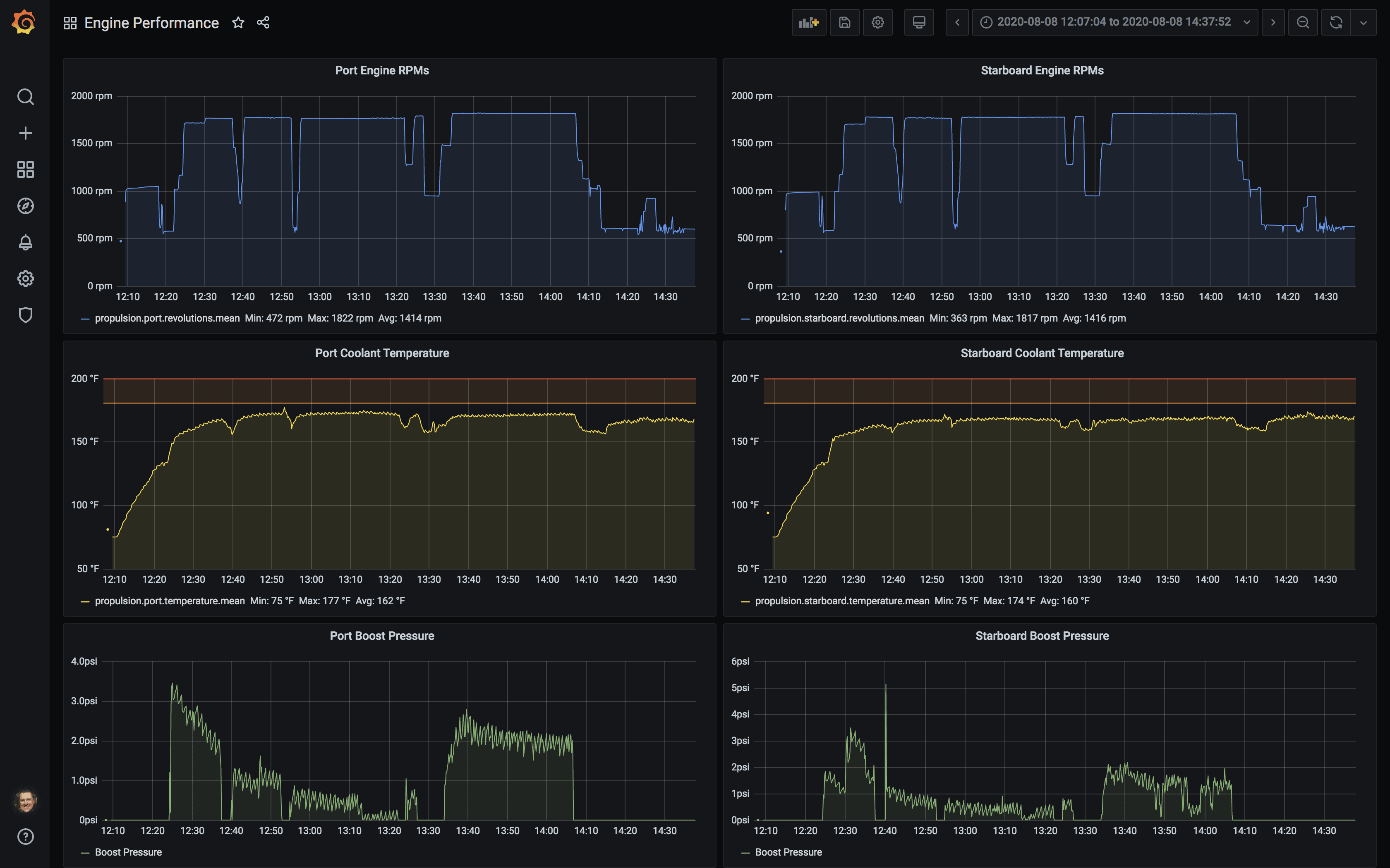
I’ve found the three things I review the most are the engine RPMs, coolant temperature, and boost pressure. My oil pressure data is somewhat funky right now, and is so stable it really doesn’t paint a picture at all.
In the run above, I was headed from Quartermaster Harbor to Elliott Bay Marina the day after July 4th to take some family home. I had to slow down a few times for random reasons, which you can see pretty clearly. You’ll also notice that my port engine runs a bit warmer than my starboard one. I also need to look a little more at the data for boost pressure as they should be pretty close for both engines as I run them both at the same RPM all the time.
I’ve tried combining some of these graphs on a single one but it seems to get too busy and hard to see things. That’s the fun part of this – you can go tweak a graph, create a new one, and the data is still fine. It provides a lot of flexibility in figuring out how exactly you want to see things.
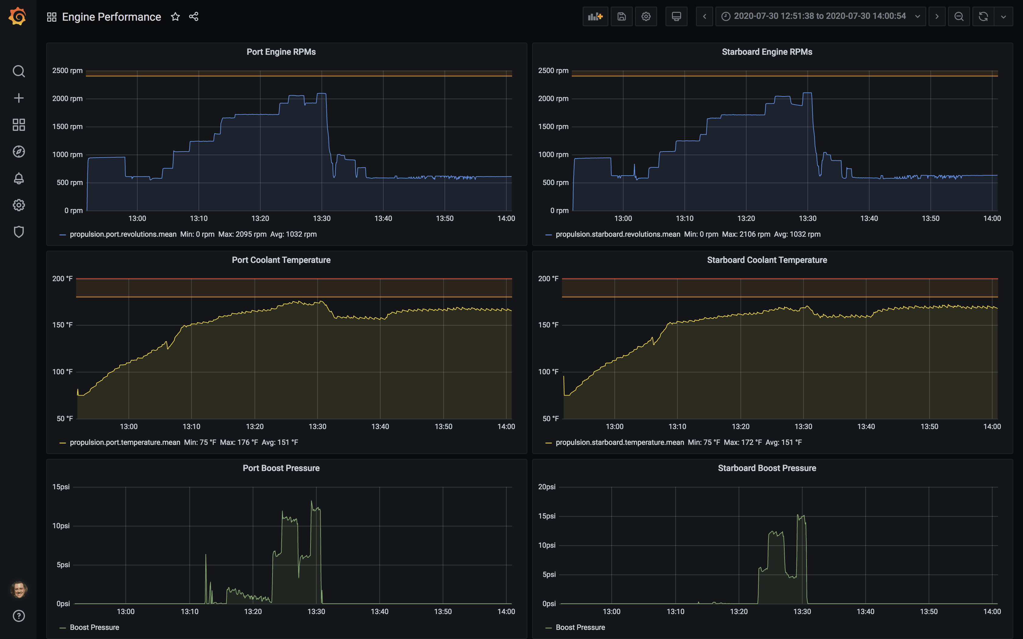
This is an example of when I was running the engines higher than normal cruise, and the port engine got close to a warning temperature. You can see the RPM graph at the top slowly stepping up as I increase speed. You can also see how it takes almost 20 minutes for my engines to get up to temperature when driving at lower RPMs out of a harbor…
Electrical System
I have a full Victron system on the boat, and their VRM portal contains a ton of information about the performance of the entire system that I could never hope to duplicate locally. However, I did put together some very helpful graphs and real time displays that I like having up while at anchor.
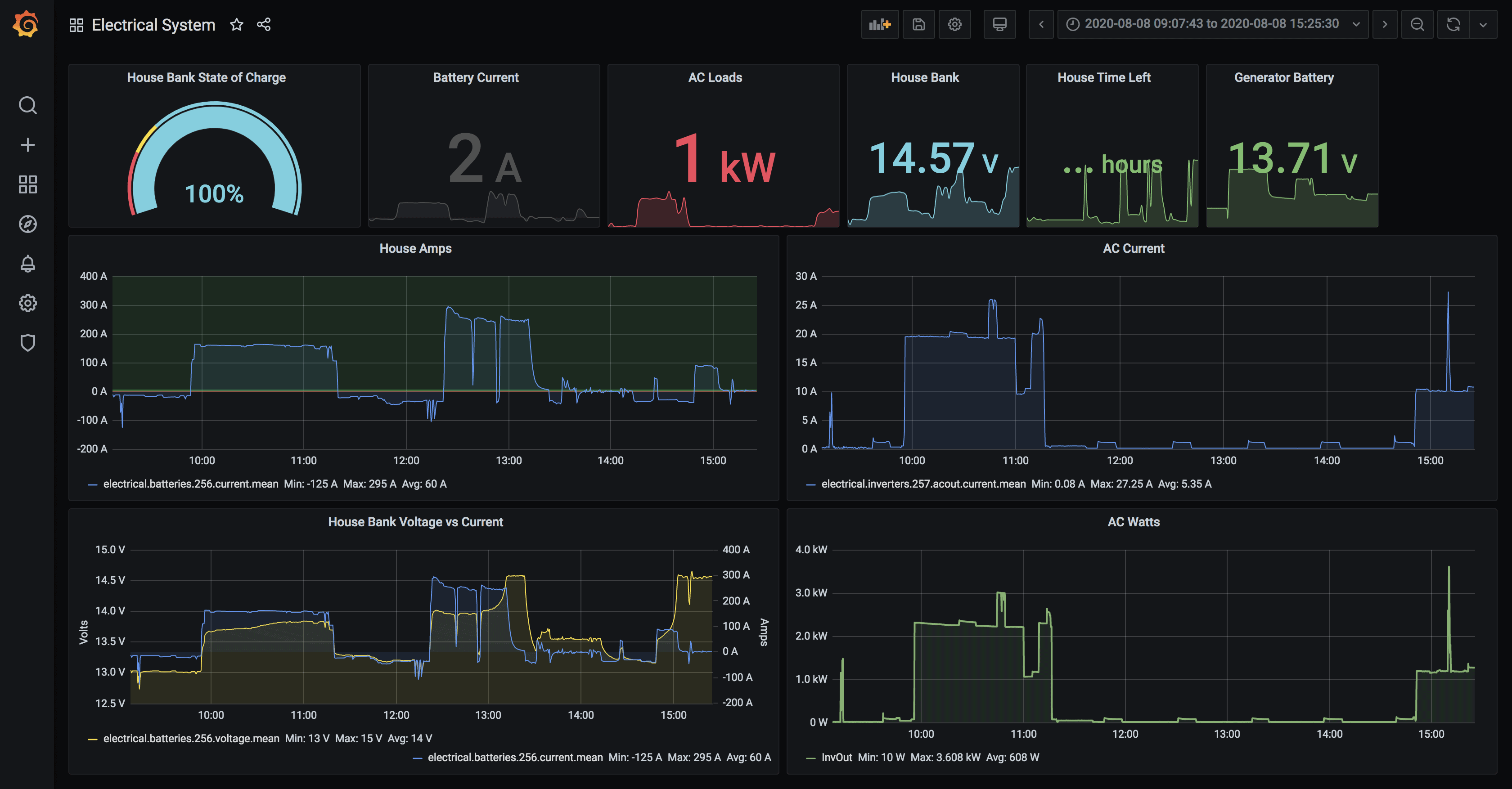
This dashboard is similar in layout to the weather one – the top contains real time squares showing State of Charge, the battery current as measured by the shunt, AC loads on the inverter, the house bank voltage, time left on the house bank (estimated), and generator bank voltage.
Below that are graphs showing the house bank/batteries on the left, and AC inverter performance on the right.
In the example above, I am charging with the generator from around 10-11AM, and then had the engines running from just after noon to 13:30 using the alternators to charge while I moved somewhere new.
The AC side shows a large usage during the generator run as I have a secondary battery charger setup to charge when on generator to speed the process, as well as had the water heater, water maker, and probably other random things going on. I try to put as much load as possible on the generator when it is on.
While it is helpful to see how things are charging, I actually find the below more interesting.
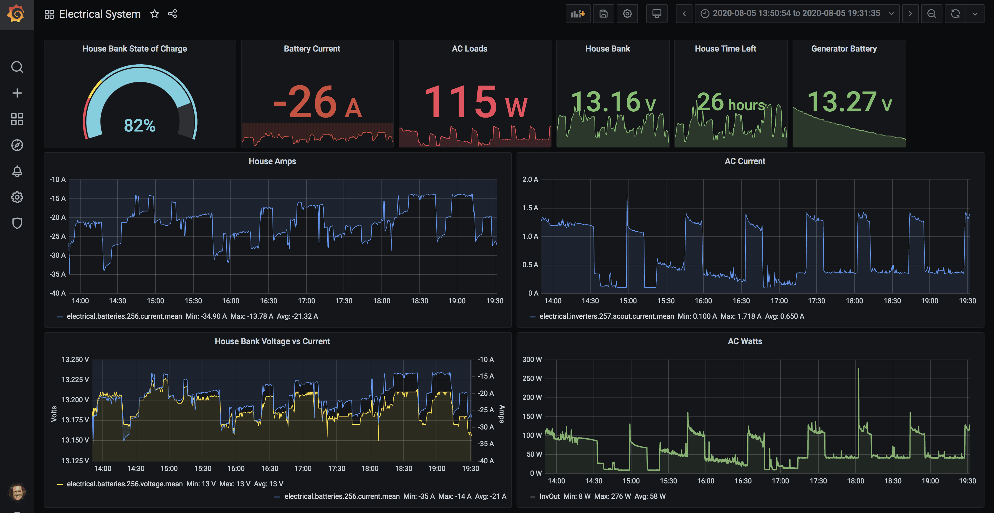
This is a 6 hour period at anchor and shows a lot more interesting trends. The boxes at the top are showing the state at the end of the 6 hours – 82% SOC with 26 amps flowing out of the battery bank, etc. The estimate from the BMV-712 is that I have 26 hours left of battery time, but that varies greatly and is not the best metric to use.
The graphs are the more interesting part – you can see the amperage out of the batteries going up and down as the AC loads in particular cycle on and off. I have a built in ice maker that uses the inverter to do its thing, and this was a warm day so it was working hard.
These sorts of graphs are what I find invaluable to watching your system performance. The graphs above look pretty normal – spikes every so often, but nothing so big that it screws up the entire scale. Those are the spikes you want to look for to try to track down problematic loads or issues.
Files
I’ve exported each dashboard and attached them below for those who are curious. However, please be aware of a couple of things:
- Data source – they are using the “rendezvous” data source from my Influx database. You won’t likely have one named that, and will need to change it.
- Metrics – my database may have metrics with names that do not match yours. For instance, do you have NMEA 2000 data from your engines? Do you call them port and starboard (many people use the defaults of 0/1).
You will most likely get errors if you import them, and it will take time to manually go in to each graph and change the data source as well as ensure you have a similar metric.
I hope you enjoy dashboards as much as me! I will continue refining these, and look forward to the next iterations that will include alerting, some additional metrics, and maybe even a new dashboard altogether!
Archived Comments
These are read only comments from the old system. Scroll down to participate in SeaBits Discussions, our new interactive forum attached to each article.
Michael Ramsay
August 15, 2020 at 9:40 am
Nice work! I think I have to disagree a little with your statement about not being able to duplicate the Victron system – I think it is the other way around. The Victron system – at least to the extent that I understand it (not much!) – only has access to its own sensors. You can access to your complete sensor array. You can do anything you want limited only by your application and processing power which is very significant (i3 I think) in your case. You can bring loads of raw or processed sensor data into Influx from anywhere and combine and display it in ways that are of use to you – all in one place with one system. Keep up the great work!
Bernard Hodges
September 28, 2020 at 10:21 am
Thanks for the info Steve. Have you carried out any analysis using the data. I am looking at actual distance covered over measured distance between waypoints – and displaying the results showing wind, tide and slip effects? Also have you set up any tidal graphs for the area in order to better estimate the effect the tide would have on course set between waypoints. If you could develop an app that takes into account tide/current and Wind effect on the course set, this could save fuel and hence cash!!!! There’s a money earner for you!!!
Bernard Hodges
September 30, 2020 at 12:37 pm
Thanks for your reply Steve.
Good powered navigators put a finger in the air and allow leeway based on wind and tidal coditions prevailing-plus a degree or so derived from previous experience. Less fastideous navigators input the course from the route plan into the auto-pilot and then continuously adjust it as they pushed off this line by wind and tide (as shown by GPS track). The second method will inevitably use more fuel and time but is this something boat skippers even bother about?
I am working on a project at the moment to determine how much time and fuel is lost by not imputting and following a single course line across the English channel by ferries. Predicting the effect of wind and tide are the main components but altering course for other ships also comes into the frame. Your notes on collecting data and displaying this has been very helpful to date. One further question…..are there a continuous real time tidal overlay for the electronic charts in your area. We are still working on the hour by hour paper overlays produced by the UKHO.


